How to build modular game UI in Unreal Engine 5
When building UI in Unreal, you may be tempted to "hard-code" your entire UI.
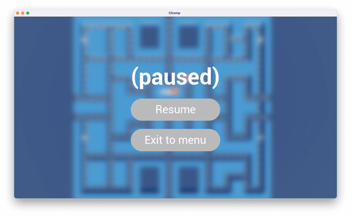
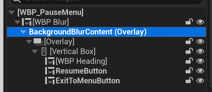
For example, let's take a button in your game's pause menu:
You might style the Resume button's Button widget and its child Text widget, and pat yourself on the back for a job well done:
- Roboto font. Size 48. Regular font style.
- 48 for horizontal padding, 24 for vertical padding.
- Half-height radius borders for each of the Normal, Pressed, and Hover button states.
The ExitToMenu button then calls for the same exact button, only with different text. Yet, instead of reusing work that you did previously, you labor and run through the tedium of toggling the appropriate settings once more:
- Roboto font. Size 48. Regular font style.
- 48 for horizontal padding, 24 for vertical padding.
- Half-height radius borders for each of the Normal, Pressed, and Hover button states.
Which is fine, I guess.
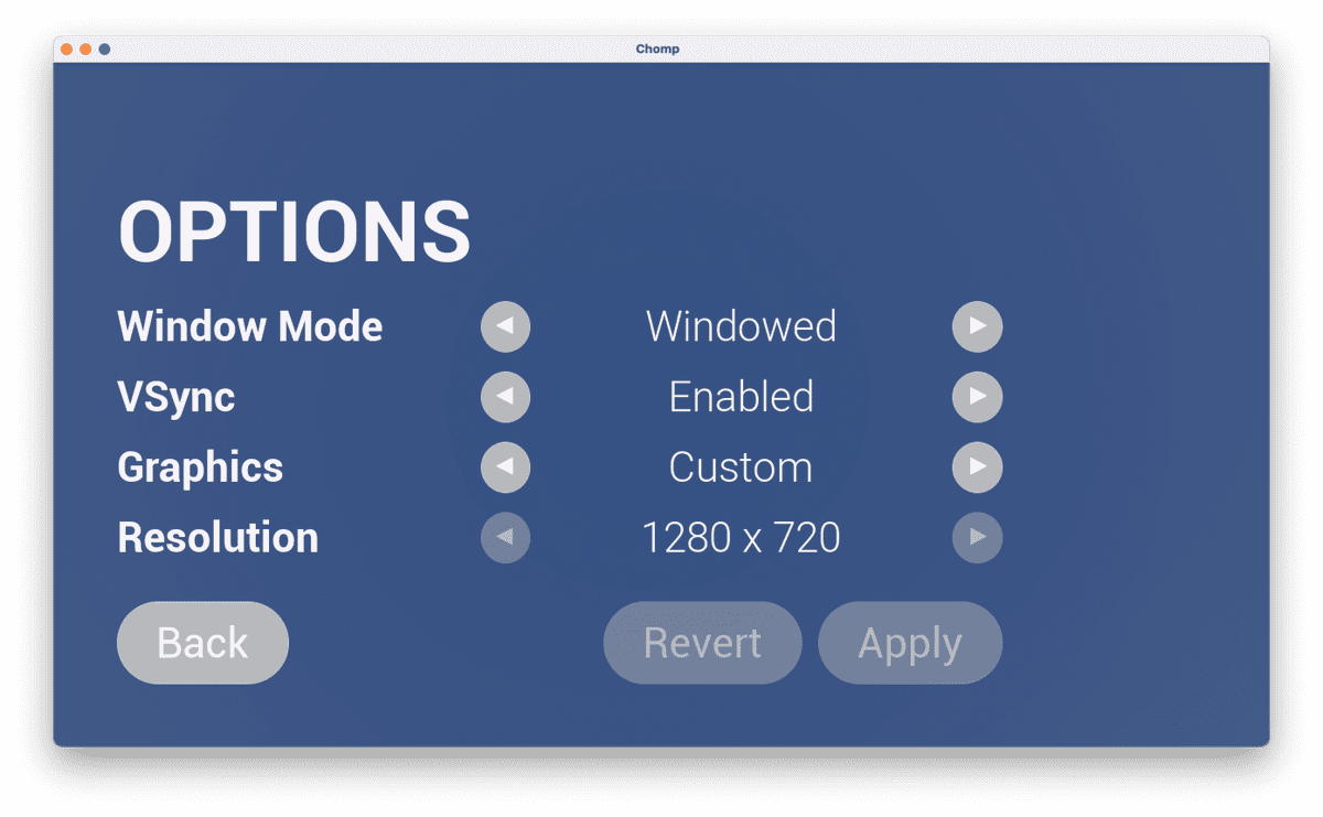
But imagine a larger chunk of UI, such as an Options widget that allows the player to tweak graphics options:
What if you wanted to use the entire Options widget twice? Both in your game's start menu and pause menu? Recreating the Options widget twice would be wasteful.
And in a game project — where UI is one among many of a game project's concerns — it helps greatly to reuse work as much as possible:
That is, you can build game UIs with greater ease by keeping reusability front and center.
Much like how web UI developers create UI components (see my blog post on the subject), game UI developers can use the same principle of modularity to make games quickly and effectively.
So let's discuss how we would do so in Unreal Motion Graphics — the UI framework that comes built into Unreal Engine 👇
1. Understand your tools
Any UI developer — whether for web, mobile or game UIs — works with a holy trinity of tools. In Unreal Engine, those tools just happen to have robust visual editors:
| Role | Web UI | Game UI |
|---|---|---|
| Describe content of UI | HTML | UMG UI Designer |
| Enhance UI with interactivity | JavaScript | Blueprint Graphs |
| Style your UI's look and feel | CSS | UI Materials |
We bring all 3 together within the structure of a component framework.
For web UIs, that might be something like React or Vue. For Unreal Engine, that framework is the UUserWidget class, which you can subclass in order to create Widget Blueprints.
So we want to start creating reusable lego bricks, and we do so by creating Widget Blueprints.
But how do we decide when and where to create them? The answer lies in...
2. Decompose designs into primitives
In any UI/UX workflow, you typically start with a design.
That design could be formalized as high-fidelity mockups in Figma. It could take the form of low-fidelity wireframes. If you're rapid prototyping, you might even forgo a formal design artifact, and simply design as you go.
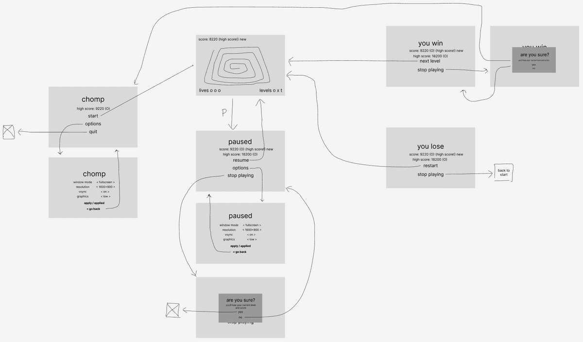
Working alone, I like the low-fidelity wireframe approach. Here's what the menu flow looks like for my latest game project, Chomp:
From this design, you would then identify the pieces of repeated UI.
Try looking for primitive building blocks first. I might identify the following:
- Button
- Heading
- Paragraph
- Score
- HighScore
Then identify more substantial building blocks that have reuse potential, such as:
- Dialog
- OptionsSelector
- OptionsMenu
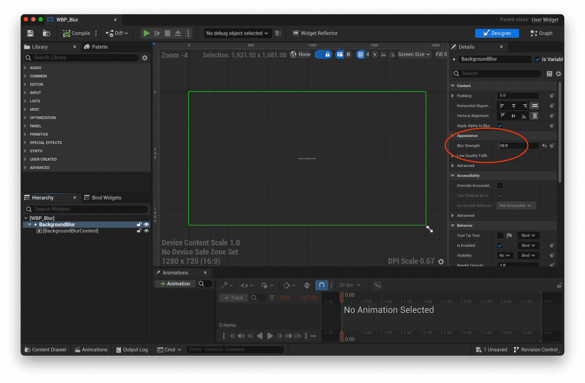
Remember that building blocks aren't limited to the content themselves. They can also be the container, as in the case of a Blur widget whose blur strength you'd like to keep consistent:
Within the Blur widget's hierarchy, you can expose a "Named Slot" widget that allows users of the Blur widget to customize the "Named Slot" contents:
3. Expose variables for data and styling
To foster reusability, our UI primitives should allow for customization.
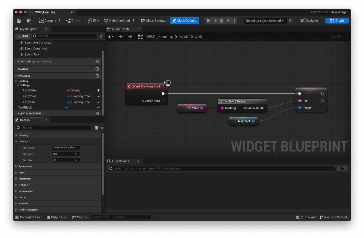
For example, a Heading widget might expose a TextValue variable for customizing the Heading's contents.
To mimic the way web headings work, it might also expose a Size enum variable:
UENUM(BlueprintType)
enum class EHeadingSize : uint8
{
    H1,
    H2,
    H3,
};
As well as a Color variable, to restrict the set of possible text colors to a desired color palette:
UENUM(BlueprintType)
enum class EHeadingSize : uint8
{
    Red,
    Blue,
    Pink,
};
By initializing our text block with the exposed variable settings through the Pre Construct event in Blueprints:
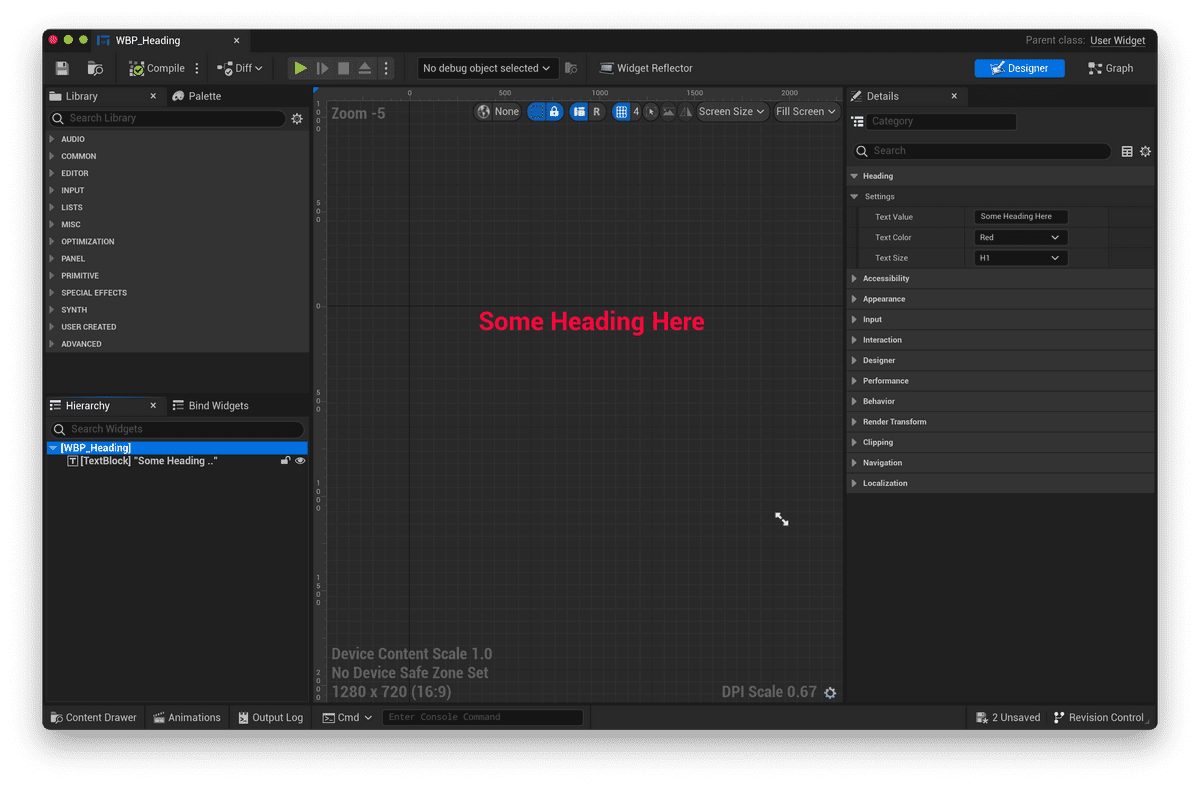
We can easily customize any instance of the Heading through the Heading widget's Details panel:
4. Expose event dispatchers for custom behavior
Widgets aren't necessarily static pieces of content.
They have behavior (such as buttons) that perform actions, or otherwise modify the state of the game in some way.
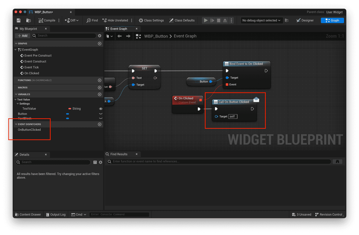
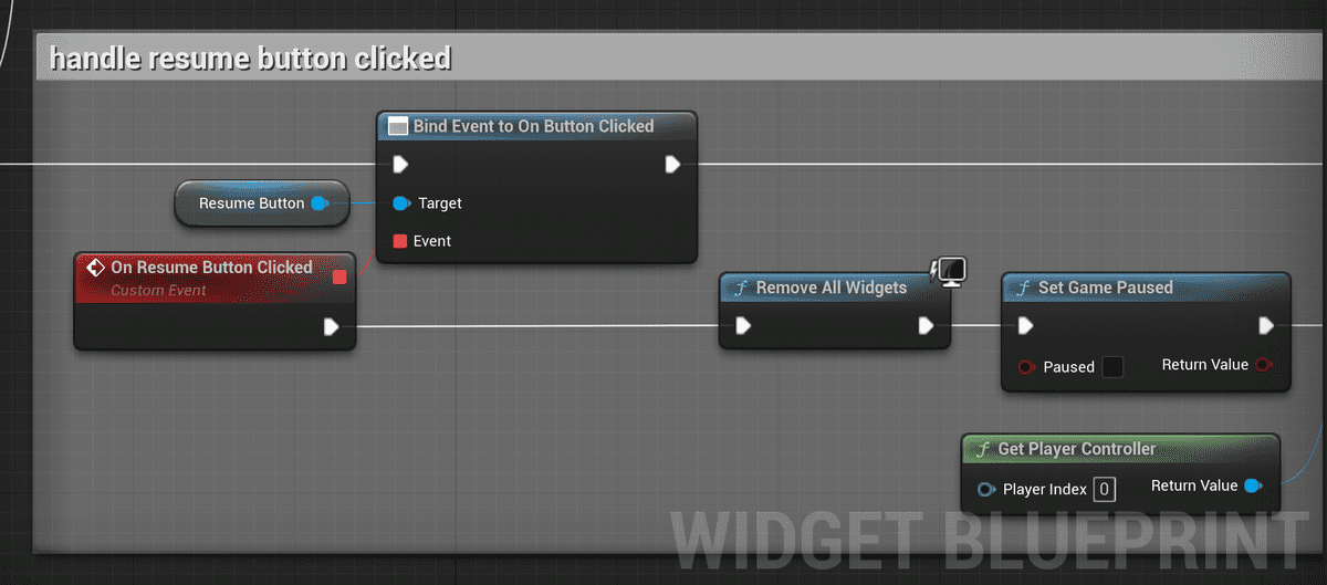
When we want to customize this behavior, we can follow the Hollywood principle (don't call us, we'll call you) and expose Blueprint Event Dispatchers in our Widget Blueprints.
(If you're familiar with React, you may recognize this pattern as passing a function down.)
Users of your Widget would then hook into these Event Dispatchers to inject custom behavior:
For other widgets where you want to encapsulate behavior instead of customizing, you might choose to forgo exposing event dispatchers entirely. Here's my implementation of a HighScore widget, where the high score data needed to be fetched from the SaveGame file:
But ultimately, whether it's for data, styling, or behavior, you make the final judgment call on reusability.
You might make the call based on repeated occurrences in your design, as we discuss in this blog post. Or you might make the call based on convenience, or expected future need.
The important thing is to do what makes the most sense for your development circumstances and accrued time budget in the long run.
5. What about the look and feel?
The great thing about creating a set of reusable widgets is that you can now work on your game's look, feel, and animation in a piecemeal fashion. It may be intimidating to dress up an entire screen of UI, but a single button is far more approachable.
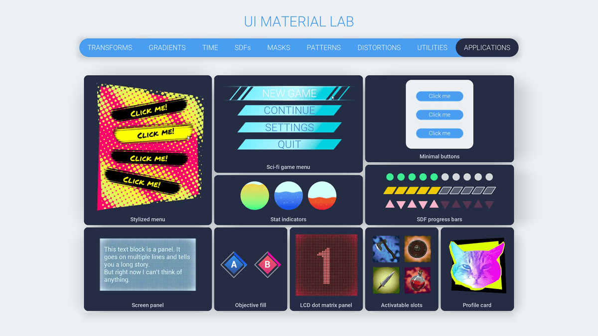
The UI Material Lab is a fantastic resource for learning how to jazz up your UI's look and feel:
Takeaways
So we’ve walked through a 3-step process for building reusable game UI:
- Decompose designs into primitives
- Expose variables for data and styling
- Expose event dispatchers for custom behavior
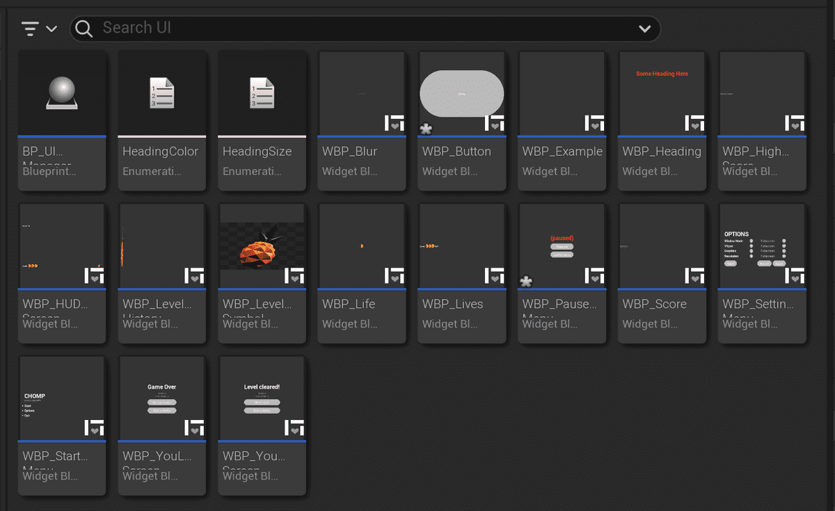
The end result? A set of Widget Blueprints that is modular, composable, and consistent. A design system for your game that you can improve and grow over time:
It becomes a joy to construct UI into hierarchies of robust building blocks, and your player benefits from the consistent UX throughout your game.
If you're starting out, I hope this brief guide has equipped you with the right mindset for constructing your game's UI. As always, until next time!
Resources
Here are some resources for learning more about modular UI construction:
- Dan Abramov's blog post on presentational versus container components applies to all UIs (including those in games): https://medium.com/@dan_abramov/smart-and-dumb-components-7ca2f9a7c7d0
- This webinar that walks through Unreal's UI Material Lab, and teaches you how to create UI Materials: https://www.youtube.com/watch?v=WaHlhkmVDoI
- Adrienne's Unreal Fest 2022 talk about templating patterns in UMG: https://www.youtube.com/watch?v=dSTdAToJ7Gg
